Instructions For Using The Custom CSS (Both Top and Bottom Navbar)
These are step by step instructions for getting the DOG DAYS template set up to look like this demo site. Once that is achieved, the custom CSS can be tweaked for personal preferences, and then final look and feel done using Site Designer in the usual way.
How long will this take? Maybe up to 30 minutes to get DOG DAYS setup correctly in Site Designer and looking the same as this demo. There will be extra time needed to save a copy of any exisiting header or custom css (in case you want to return to what you had).
Then we have to allow time to set a few things in Blockbuilder, and make any adjustments to things in there. Probably another 30min.
So allow at least 1hr, though actual time taken will depend on you. Those that feel they want to see every single combination of paddings, borders, margins etc, will naturally take a lot longer than somebody that is happy to have the default look with a few minor changes!
Note: These instructions are for BOTH the top fixed, and the bottom sticky navs. Where CSS or a procedure is different for one of them, I will make that clear. Otherwise, assume that each step is for either of the nav choices.
Step One: Get The Custom CSS Download
Download this zip file. (V1.1) It contains txt files of the CSS (seperate ones for top or bottom nav) along with a README, changelog, js file for the bottom sticky nav, and a copy of the headers and logos used on this demo website.
You don't have to use those demo images of course, although for a new site that doesn't yet get traffic, you could use them initially just to get setup nice and quickly. Then change them to your own ones once the new design is in place.
Otherwise, just use the dimensions as a guide to what looks good, though there is absolutely no reason you have to stick to them! The header is 260px tall, but if you want to use one that is (for example) 350px, then no problem, go ahead. Our new custom CSS will give a very quick and easy way to increase the header height.
The width of the demo header is 1920px wide, but of course you don't have to go that wide with yours.
Step Two: Install DOG DAYS If You Don't Already Have It
Before choosing DOG DAYS as your template, you might want to save a copy of your current header, and any custom CSS that you have added via Site Designer. Make a note also of the main settings you have used, in case you ever want to revert back. The various paddings, margins, color codes, that sort of thing.
Step Three: Add Your Custom CSS
After you have downloaded the zip file, you want to choose the CSS file in there that is for your chosen nav option. The bulk of the CSS in both files is the same (as are the instructions for setting up) but of course there are some differences with the CSS for the navbar and header area.
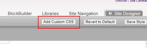
So, paste the CSS into the "Add Custom CSS" area of Site Designer.
Step Five: Upload Header And Logo
Unlike any of the standard responsive templates, we are going to have a clickable logo in the header. You can choose NOT to have this of course, but you might want to follow the steps anyway, in case you change your mind later.
There are two places you can upload an image into the header, and most people will have used the standard Header position exclusively. However, the WRAPPER for the Header is also available, so we are going to utelize both of these.
We are going to upload our header image to the wrapper (which sits behind the standard header image position) and then upload our LOGO to what would normally be the header image position, and tun the background color to transparent. That will allow our main header pic to show through, with the logo sitting on top of it. So go ahead and do this.
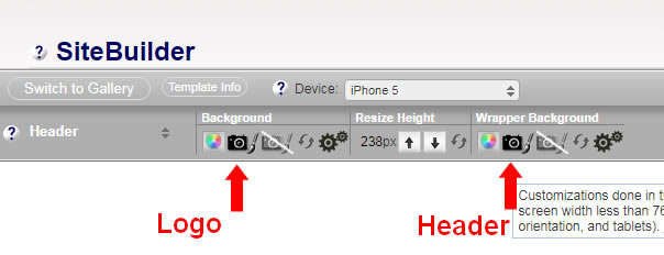
Set The Header Sizes: click the cog in the Wrapper Background section to check the header image sizing. Use whatever looks best on each of the 4 views, but the demo is using all of them set to auto. If you choose something else (such as 100% auto) on the mobile views, you might find that the header image reduces in size too much and leaves a gap.
Next, we want to check the header height. There are 4 views that you need to check...desktop, the first 2 mobiles (that's the iPhone 5) and the iPad in potrait mode.
These should be at the minimum heights for each of them. In other words if you click the little arrow to make the header smaller you should get a notice that the header is at the min height. That is what we want to see as we will fine tune our heights later.
Step Six: Set The WebsiteName and Tagline
I have kept to the default fonts, but I have changed from ALL CAPS to Capitalized. I have also set the background behind these to transparent.
Don't forget to do this in all 4 views... desktop, iPhone 5 portrait and landscape and iPad portrait.
I have not touched any of the margins or paddings. Opacity is not changed in S.D, I have set it to fully opaque in the custom CSS.
Here are the font sizes I have used for each of the views. Note size decreases with screen size. There is room to change these, just be aware of text overlapping logo in small screens if you increase too much, especially on the iPhone 5 portrait.
Desktop: WebsiteName - 24px bold. Tagline - 21px bold
iPhone 5 (portrait) WebsiteName -16px Tagline - 14px
iPhone 5 (landscape) WebsiteName -20px bold. Tagline - 18px
iPad (landscape) Same as above
Step Seven: The Navbar
You can select top of bottom for this, but it actually doesn't make any difference which you choose as our custom CSS will overwrite that. But you may as well choose the correct one anyway.
Font Family is default, size has been set to 16px and the Text Transform changed to Capitalize.
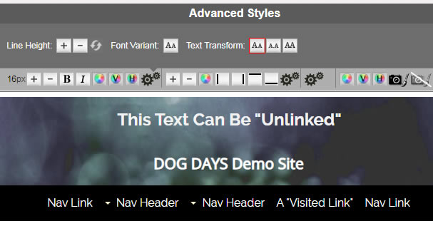
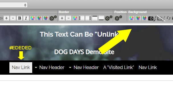
The background color for the links is set to transparent, transparent, and #EDEDED on the hover. Fine tuning of colors can take a long time so leave it at that for now, and we will move on. You can refine your look and feel with things like this after we are finished with the custom work.
Step Eight: The Horizontal Navwrapper
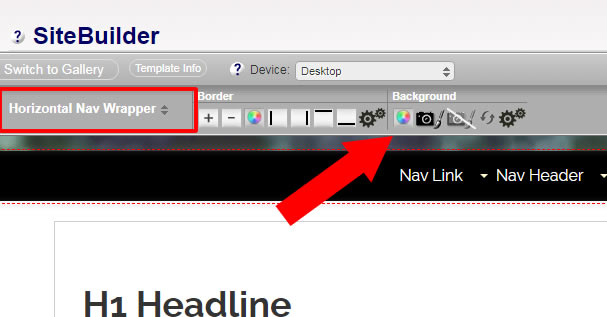
This stretches fullwidth across the page, and is what provided the background color for your nav. I have the demo set to black, but you will choose whatever is appropriate for you.
Note that there is no transparency on this now, it is fully opaque. if you do indeeed want some transparency, then we change that later when we tweak the custom CSS. For now, it will be a solid color.
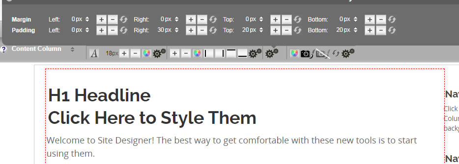
Step Nine: Setting the Columns Paddings
We are now going to reset the paddings of both columns. So for the NavColumn, we want zero padding on the left and right. You might think I am incorrect with that and you need some padding but please trust me on this. It will become clear in the end!
NavColumn Padding: 0px 0px 20px 20px
ContentColumn Padding: 0px 30px 20px 20px
Why Did We Do This? Do you see that pale grey line around the content? That is the "#ColumnsWrapper" which is not available to either see or use in the default setup. Therefore, the standard setup required padding on the left and right to keep content from touching the edges when it is at fullscreen width.
But this wrapper has been "reactivated", by using a clearfix in the custom version, meaning we can apply our left and right padding to that instead. It makes things much easier, and has the additional benefit of allowing us to style it. For example, we might have it as a white background, and put the body to a different color, giving us a nice edging. Or, we can just remove that gray line later and have the plain white everywhere like the default, but still taking advantage of the padding we apply to it with our custom CSS (which is 25px each side, we can change that later).
So really, the only padding we actually need on the columns, is some right on the content column, to adjust how much of a gap we have between the columns. We just set this to 30px, but if you want more or less, go ahead and change that.
WANT A COLORED BACKGROUND ON YOUR NAVCOLUMN?
If you choose to do this, then the lack of left/right padding will become obvious. The content will sit to the edge of the color. So in this case, you may wish to use some padding, perhaps 10px left and right. That would leave you with 320px usable width.
Our column is set to 340px (unless you alter that) so we will still have a usable width of 320px. You just need to be sure not to put so much padding in here that your column becomes less than that 300px if you want to use MediaVine or have Adsense display their larger (and better paying) ads.
My suggestion if you do this, is to set the background back to white in your mobile views, and remove the padding. If you don't then the nav column will be a little narrower than the content column due to the 10px left/right padding.
Responsive Navigation
Now we move onto getting the mobile navigation setup. Don't worry, we are almost done with Site Designer set up and will be moving onto the final part on a Block Builder page shortly.
Select Responsive Navigation (iPhone 5 view) and then change the menu button background to #EBEBEB Even if this is not your desired final color, set it to this so that it matched the border below the header and creates the illusion of a tab. When it comes time to tweak the custom CSS you can change BOTH of those together. You will need to set the color for the landscape view, and the iPad portrait as well.
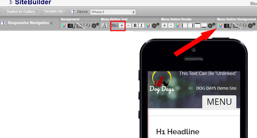
Notice I have the font size for the button set to a very large 30px? That is because in the demo, I have opted to use html to create a hamburger icon (will be done in BB later) and a bigger font size is better for that. But if you want to keep the MENU text instead of the icon, then just set this to a reasonable size for the word. Perhaps 18-20px
That's it for the initial Site Designer Setup! Now we move onto the Block Builder. But there is a lot less to do there, so it will be quicker.
Complete The Setup In BlockBuilder
Open a page in Block Builder. Any page will do, although usually you would choose the index page unless there was a reason not to (perhaps a special unique page layout?)
Step One: Get Navbar Set Up
Put your navbar block into the top sitewide dot in the header, if it is not already there.
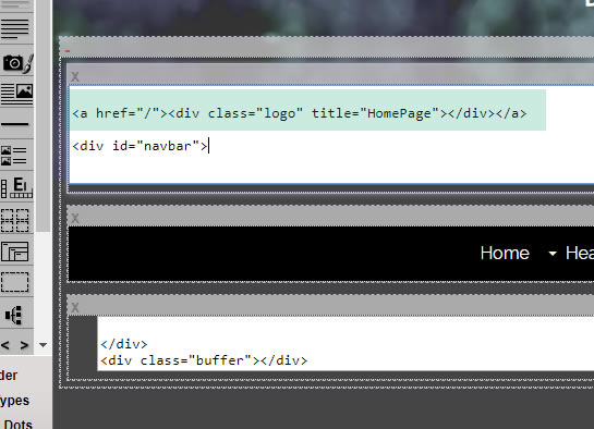
Using Top Fixed Navbar? Put a RAW HTML block above the navbar, and put in the logo HTML, as shown in the green highlighted section of the screenshot.
Using Bottom Sticky Nav? Then you need 2 raw HTML blocks, as shown in the screenshot. Copy the html exactly as you see below, including the green hightlighted part.
Step Two. Navbar Alignment and Hamburger Icon.
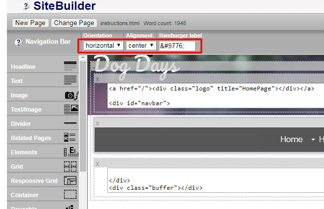
Select the Navbar, and choose the options in the screenshot. The code gives the hamburger icon. In fact if I type it out now, it should display on the page, even though I am using a text block and not RAW HTML. ☰
The nav will be much better centered, you really don't want it left aligned. While it might look good that way on your particular laptop, think about somebody using a widescreen MAC with 2600px resolution. The nav links would be a long way from the actual main content. You can get away with left aligned in the default template as that is capped to a max width of 1600px.
Step Three: Javascript For Sticky Nav
This is for those using a sticky nav at the bottom of the header. Please ignore this step if you have a top fixed nav.
In the zip package you downloaded, there was a javascript. Place a RAW HTML block into a sitewide dot near the footer, and paste in the script. Your sticky nav should now work!
Last Step: Preview The Page!
That's it, you should now have a functional page that looks good. If so, then you can build it, and check the page on your site. If it doesn't look right, hopefully you can go over the steps to see if you can find your mistake. If all else fails, email me and I will try to find the problem for you.
So next job is to look at the custom CSS we have used, and make any necessary tweaks to it. You will find the info for that on this page.
This column will always be at least 300px wide (plus padding), meaning that it is suitable for MediaVine, or the larger sized Google ads.
Because the column is fixed wider than default, it means that layout looks best if the columns change to tablet/phone layout at a larger size.
So, the breakpoint of 980px is where the columns will become block level and full width, although the top nav will remain as desktop view until the normal width of 768px. At that time, the nav changes to the mobile view button.
Home | About Us | Contact Us | Privacy Policy
Dog Days Template, Demo Custom Version
Copyright © 2019- All Rights Reserved