Tweaks To Custom CSS
My Top Tip: While we have our custom CSS in Site Designer, I find it much more efficient to make a copy of that, and paste it into the head section of the Block Builder page, choosing This Page Only. if you do this, then you must put the CSS beteeen <style> </style> tags!
That way you make a change to the CSS, preview the page and see changes immediately. The CSS in the head section will over ride the CSS in Site Designer. When you are done and it all looks as you want, you can copy the revised custom CSS back into Site Designer, replacing what you have in there.
Now that the basic layout is in place, it is time to make a few edits to the custom CSS. Before making a start, be aware that the template settings when you install DOG DAYS are not always the same settings as what you see on the example site in Site Designer. For example, when you install DOGS DAYS you will find by default it gives you 45px of left padding, both on desktop and mobile views. On the TenderBarks demo site, the padding is set to 16px.
45px is too much on a mobile device, especially since our custom CSS gives us 25px padding on each side of the ColumnsWrapper, which default template doesn't have.
The Main Class/IDs In The Custom CSS
Below, is a description of each class or ID that you can modify in the custom CSS. Note that there are some small variations in this, depending on whether you have selected a top fixed navbar, or a bottom sticky one.
If a class has properties or values that you can edit, there is a red border to show the values that can be changed. Working down from the top of the custom CSS, we have...
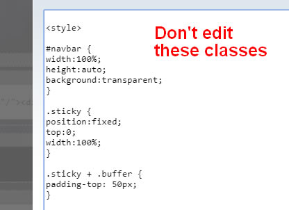
These first style rules are for sticky nav at the bottom of the header only. Those using a top fixed nav can skip down to the #PageWrapper.
#navbar This is a div placed to surround the actual menu bar, and the height is set to 50px. This is the height of the DOGDAYS navbar with default settings. Once you start to adjust the horizontal nav fonts and paddings in Site Designer, you might find the actual navbar height changes a bit. Unlikely that it will, unless you play with paddings.
.sticky This is what is applied to the navbar once it scrolls to the top of the page.
.buffer is a class that adds 50px of padding to the class ONLY when the navbar reaches the top of the page. This helps with minimizing a sudden "jump" from the navbar.
#PageWrapper This has been extended out to 100% screen width and is what gives us a full width header and footer background. Leave this.
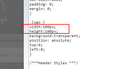
.Logo The logo image on this demo is 100px square. It was created at 200px and reduced via our cutom css to be half that, which improves the sharpness of the image. The logo image itself is not what gets clicked. It is the div with the class of "logo" that sits over the top of it.
That means if you make your logo bigger (say 200px tall by 300px wide) then that gets reduced by half, so you would change the width here to be 150px.
#Header, #Header.Liner and #Header.WebsiteName, #Header.Tagline The screenshot below shows the areas that canbe changed. There are quite a few edits you can make, so let's look at them. Be aware that your css may vary a little depending on your navbar choice.
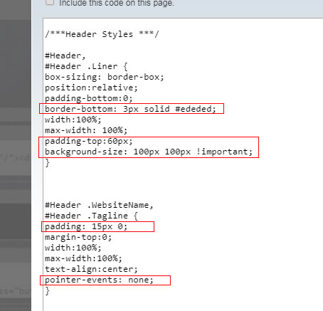
border-bottom: This is for top fixed nav. This color should match the background of the menu button, setup in Site Designer. So if you change the color here, change the menu button to match.
padding-top: This is for top fixed nav. 60px is to make sure the top fixed navbar doesn't cover the logo.
background-size: If your own logo is not square like the demo one, you can adjust here to compensate. if it was (for example) 200px tall x 300px wide, then you would change the width of 100px to 150px.
padding: This is the padding that both the WebsiteName and Tagline have. If you increase this, then naturally your header height will increase accordingly.
pointer-events: This is what removes the link from your Website Name (not really required if you have a clickable logo, IMO). But if you want to go back to the default, then just delete this line.
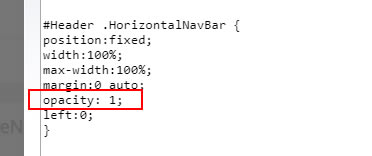
#Header .HorizontalNavBar This has either position:fixed or posiition:relative, depending on your navbar choice. The opacity is the only value that you might want to change. 1 is fully opaque (how it is in this demo site) and 0 is fully transparent. The default value is .65
.ResponsiveNavWrapper and .ResponsiveNavWrapper::after These should not be edited.
#ColumnsWrapper and #ColumnsWrapper::after You can remove or edit the border and background color. If 1200px is not wide enough for you, then you can increase the px width, but I suggest not going above 1400px otherwise the content column line length is too long.
The padding is 10px top and bottom, and 25px each side (this applies in mobile views as well, so don't go too much higher lower than this just because it looks OK to do so in desktop view). If you are removing the gray border, then you can comfortably reduce the 25px down to perhaps 10-15px.
#ContentColumn and #NavColumn This is where the fixed width of the NavColumn is set... the ContentColumn will take up whatever space is left over from the NavColumn width. Both instances of the px value must match, in this case it is 340px. Do not go less than 310, if you want to be "MediaVine Ready" although you can go higher if you wish.
However, 320-340px is a good width to use if you want to display MediaVine and the larger Google ads. Because we have zeroed out the columns padding in Site Designer, the width you see here is what the NavColumn will actually be. I did say this makes things easier!
The Media Queries Section
This section starts off with resetting the sticky/fixed navs back to a normal scroll for mobile devices, and then there are several style rules to ensure widths paddings and margins are all set correctly for smaller screens. No need to touch any of that.
The Media Query For Larger Screens
While you are unlikely to ever need to edit this first part, it might be useful to understand what it does, and why we have it. So look at the screenshot below.
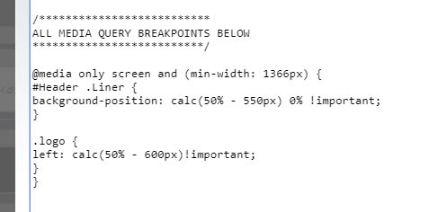
Our breakpoint is set to a min width of 1366px so it is only going to affect larger monitors. As we have a full width header, the logo will sit on the far left. And on those really BIG widescreens, that is a long way from the main content!
So we need a way to keep the logo image (and the clickable div over the top of it) at the same width as our content area, which is set to 1200px.
That means we can use a calc in the CSS. Look at the first class, which is for the logo image. The 50% means that the image is exactly centered horizontally. We then move it over half the width of the content area (which will be 600px) and then deduct half the width of the actual logo, which would be 50px. And that gives us our logo with the left edge precicely 600px from the middle. Pretty neat eh.
And it's much the same with the clickable div, except we don't have to account for half the width of it. That is because it is the LEFT edge of the div that is on the center line.
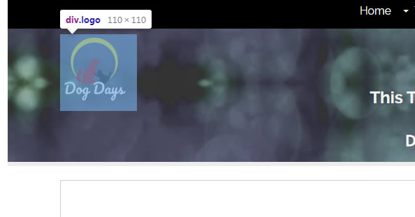
See the screenshot below to see how the logo image is exactly in line with the content and the clickable div sits over the top of it. Even if the monitor (and therefore the header) is 260ppx wide, the logo will stay in that position. On screens smaller than 1366px, the logo will of course position itself at the edge of the page, but that is fine... it's still nice and close to the content area.
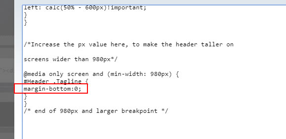
Increase Header Height In Desktop View
Our first breakpoint where columns change to 100% width and stacked one on top of the other, is 980px. This is because of our fixed with right column (previously explained).
So this class affects desktop view only, and will increase the margin below the Tagline, making the header taller. Just remember, if you increase it more than what the height of your header image is, you will see a gap start to appear below the image, showing whatever color you have as the headerwrapper background.
Set WebsiteName Margin, and ColumnsWrapper Padding
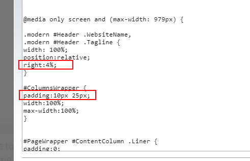
The right:4% is how far from the right edge your WebsiteName and Tagline will be, on smaller screens.
With the ColumnsWrapper padding this is set to be the same as it is in desktop view. However, if you want more or less padding on the smaller screen, this is where to make the adjustment.
After this, there are a few classes that don't need to be touched. Mostly to do with resetting things to mobile views, so width, paddings and so on for those should be left alone.
Then we get to some classes that can be edited...
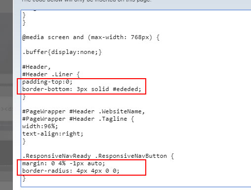
If you want to increase the header height from the top, increase the padding-top from zero to some px value.
The border bottom is for those using a sticky bottom nav. Remeber when we set the background of the menu button to #ededed in Site Designer? And there was a 3px border of the same color in the custom CSS for those using a fixed top nav?
Well, the time has come for those using a sticky bottom nav to put that border in place. The color should match the background of the menu button.
.ResponsiveNavButton The margin here is placing the button 4% from the right edge, and overlapping the bottom colored strip below by 1px. If you wanted the button to be on the left instead, swap the 4% and the auto... the button will then be 4% from the other edge. If you wanted it centered on the bottom, you would change the 4% to auto. Placing in other positions is beyond the scope of these customisations... other than deleting the line of css and the button would return to its original position, which is centered and not sitting flush with the bottom.
border-radius is how much the top corners are rounded off. Bigger number means more rounding. In fact, if you want to see the button look even more like a tab, change the 4px values to 50%. See screenshot below. And for no rounding, you can delete that line entirely, just have straight edges.

One Last media Query!
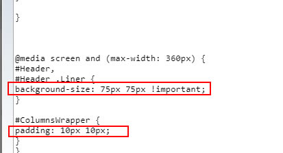
The two classes in here are for screens =<360px. We reduce the logo image a bit, so that the WebsiteName and Tagline don't cover it. And we have the option of reducing the ColumnsWrapper padding even further than we did earlier, to make full use of of the screen width.
Finished!
Once you are happy with how it looks you can copy the revised custom CSS into Site Designer. Altenatively, you can have the custom CSS in Block Builder as it is now, there is no reason not to if you want to do that. In which case, just make sure it is in the Sitewide section of the head, and save the page.
When you have checked it is all working on the live pages, the custom CSS in Site Designer could be deleted. But just remember, if you do that, the Site Designer will NOT look great! It can't "see" your custom CSS in the Block Builder. So, swings and roundabouts really. Either way is fine, and do whatever works for you.
Now it's just a matter of performing any final Look and Feel changes that you feel you want to make in Site Designer.
This column will always be at least 300px wide (plus padding), meaning that it is suitable for MediaVine, or the larger sized Google ads.
Because the column is fixed wider than default, it means that layout looks best if the columns change to tablet/phone layout at a larger size.
So, the breakpoint of 980px is where the columns will become block level and full width, although the top nav will remain as desktop view until the normal width of 768px. At that time, the nav changes to the mobile view button.
Home | About Us | Contact Us | Privacy Policy
Dog Days Template, Demo Custom Version
Copyright © 2019- All Rights Reserved